
I’ve been taking a series of technical courses through Train in Data on Feature Engineering, Machine Learning Interpretability, and Clustering and Dimensionality Reduction. One particular aspect I appreciate is that after discussion of a technique, the instructors provide some working sample code. I walk through each of these examples, usually on Kaggle, running their code, and experimenting as I go. In this series of blogs I’ll trace the path I took as I started with simple experimentation on the k-means clustering algorithm, then began digging deeper into alternative GPU implementations, and eventually produced a framework to test and analyze my results.
Clustering and Dimensionality Reduction
The course that inspired this work was Clustering and Dimensionality Reduction, which covers topics including dimensionality reduction, visualizing high-dimensional structure, and grouping high-dimensional data into meaningful clusters.
A quick note on what “dimensions” means here, because I’m not talking about points floating in physical space. In data analysis, a dimension is simply one feature; one measurable aspect of whatever you’re studying. A house might be described by square footage, number of bedrooms, year built, distance to a good school, and two hundred other things. Each of those is a dimension. A flower can be described by petal length, petal width, sepal length, and sepal width — four dimensions. A mall customer might be described by age, annual income, and how frequently they visit — three dimensions. The “space” these dimensions form is abstract, but the math works the same way.
Dimensionality reduction techniques like PCA can dramatically reduce the number of dimensions needed to represent data accurately. Rather than selecting original features, PCA builds a compressed representation by combining features in a way that captures most of the variance in far fewer dimensions. Noise and redundancy tend to fall into the components that get discarded, which makes downstream techniques like clustering faster and often more effective. The tradeoff is interpretability: In the PCA space you are no longer dealing with the same features, such as square footage and number of bedrooms, but weighted combinations of them.
A visually compelling use of these techniques is reducing data all the way to two or three dimensions for plotting. Humans can’t visualize beyond three dimensions, and even three is a stretch, so this kind of compression can reveal patterns — clusters, outliers, gradients — that are completely invisible in the raw data.
Focus On Clustering
While dimensionality reduction is a fascinating subject in its own right, my curiosity was caught by the other half of this class: clustering, or the mechanics of finding natural groupings in data. Customer segmentation is a classic example: given purchase history, browsing behavior, and demographics for a million customers, can you identify distinct groups that behave similarly? Once you can, you can tailor products, messaging, or recommendations to each group rather than treating everyone the same. The same idea applies across a range of fields: grouping genomic sequences, organizing documents by topic, flagging anomalies in network traffic, identifying cell types in biological imaging.
K-means clustering is the particular rabbit hole I jump down in this blog series, although I will use dimensionality reduction techniques to produce (often colorful) two dimensional visualizations of clusters that actually exist in many dimensions.
K-means
K-means is one of the most widely used algorithms for clustering. There are situations where other approaches handle irregular shapes or varying cluster densities better. But k-means is fast, interpretable, and a good starting point.
K-means works by partitioning data into K groups, where K is a number you choose in advance. You might know K ahead of time (such as the number of baseball teams in a league), or you might run a series of tests with various values of K to determine which one seems to most fit best.
The algorithm alternates between two steps until it settles on a stable answer.
First, you create K centroids and assign every data point to the closest one. A centroid is just a position in your feature space either chosen at random, or by a smarter initialization strategy. I’ll come back to centroid initialization strategies later. Once every point has been assigned, you have K clusters, even if they’re rough.
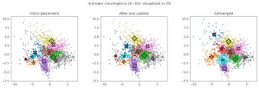
Figure 1: Three iterations of k-means on a 2D dataset with ten natural clusters. Left panel: initial random centroid placement, with points colored by their nearest centroid. Middle panel: after one update centroids have shifted toward the mean of their assigned points, and some points have switched clusters. Right panel: converged result, with centroids settled and cluster boundaries stable.
Second, each centroid moves to the average position of all the points currently assigned to it. That’s the “means” in k-means. After the move, some points may now be closer to a different centroid than their current one, so the assignment step runs again. The two steps repeat until no points change assignment and the algorithm has converged.
The quality of the result can be measured by inertia: the sum of squared distances from each point to its assigned centroid. Lower inertia means tighter, more compact clusters. The algorithm is guaranteed not to increase inertia at each step, which is reassuring, but it is not guaranteed to find the globally best solution. The result depends on where the centroids started, which is why k-means is often run multiple times with different initializations, keeping the best result.
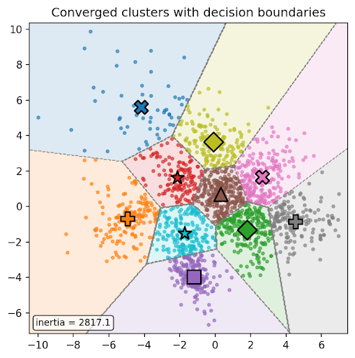
Figure 2: The final cluster boundaries (Voronoi regions) drawn explicitly, with centroids marked. This marks inertia — the sum of squared distances from each point to its centroid — as a measure of how tight the clusters are.
This brings up a key k-means question: how do you choose K? As mentioned above, a common approach is to run the algorithm across a range of K values and plot inertia against K. As K increases, inertia always decreases. At the extreme, if K equals the number of data points, every point is its own cluster and inertia is zero. What you’re looking for is an “elbow” in the curve, where adding more clusters stops buying you much improvement. I’ll come back to this, and to another metric called the silhouette score, later in the series.
Scaling K-means
K-means looks simple on paper, but it hides a scaling problem. At each step where you assign a point to a centroid, every point gets compared against every centroid. With N points and K clusters, that’s N × K distance calculations per iteration, and each distance calculation involves as many operations as there are dimensions. For small datasets this is trivial. For a dataset with a million points, fifty clusters, and twenty dimensions, you’re doing a billion operations per iteration, and running several iterations to converge, possibly several times with different initializations.
If, as I just described, you are searching for the best value of K, you will do all of these operations for each K value you test!
This is exactly the kind of computation that maps well onto a GPU. A CPU is designed to handle a few complex tasks quickly, but a GPU is built to handle enormous numbers of simple tasks simultaneously. Distance calculations are simple and independent. Each one doesn’t need to know the result of any other, which makes them a natural fit for a GPU. We’ll get into exactly how this works in Part 2, but the short version is: if you can express k-means in the right way, the hardware can do a lot of the work in parallel.
I started experimenting with some simple k-means implementations, varying centroid initialization functions, data sets, and other parameters. I soon reached a point where I needed to organize my work to keep track of the results.
Creating a Framework
After creating a few k-means implementations I was struggling to keep track of the various tests and datasets, and meaningfully compare results. I realized that I needed an organized, consistent framework if I was going to keep working on this. That meant several things: random seed settings for all variable parameters, a consistent way to measure how long each implementation takes, a way to track how much GPU memory it uses, a set of datasets that would stress the algorithm in different ways, and a way to ensure every implementation was starting from the same initial conditions.
Timing
Timing GPU code is trickier than it sounds. The naive approach, recording a timestamp before and after a function call, works fine on a CPU, where execution is sequential. On a GPU, operations are dispatched asynchronously: your Python code queues up work on the GPU and immediately moves on, without waiting for it to finish. If you stop the clock right after the function call returns, you’re measuring how long it took to queue the work, not how long it took to do it. The fix is to call torch.cuda.synchronize() before recording the end time, which forces the CPU to wait until the GPU has finished all pending operations.
There is one more complication when benchmarking libraries like KeOps that compile code at runtime. The first time KeOps encounters a new formula, it generates and compiles a CUDA kernel on the spot. That compilation can take several seconds and completely swamps the actual compute time, making the first run useless as a measurement. The fix is straightforward: call the function once to trigger compilation, discard the result, then take the real measurement. All subsequent calls in the session use the cached kernel and reflect actual performance. This pattern applies to any JIT-compiled GPU code — including PyTorch’s own torch.compile().
Memory
Memory tracking also has a wrinkle. PyTorch’s memory allocator reuses previously allocated blocks, so peak usage during one run can be invisible if a previous run already claimed that memory. The fix is to call torch.cuda.reset_peak_memory_stats() before each timed run, which clears the high-water mark and ensures you’re measuring that run’s actual peak rather than an artifact of whatever ran before it.
Data
I started with the simple Iris dataset, but realized that to fully test my code I needed a range of datasets with various characteristics, varying in size, dimensionality, and cluster structure. I settled on six commonly used examples, and one synthetic dataset generator:
| Dataset | Points | Dimensions | Clusters | Notes |
| Iris | 150 | 4 | 3 | Three iris species; small and clean, good for verifying correctness |
| Wine | 178 | 13 | 3 | Three wine cultivars; features have very different scales, making normalization important |
| Mall Customer | 200 | 3 | ~5 | Purpose-built clustering demo; cluster count is convention rather than ground truth |
| Credit Card Fraud | 284,807 | 29 | ?? | Features are PCA-transformed for anonymization; heavily imbalanced toward legitimate transactions |
| MNIST Digits | 1,797 | 64 | 10 | Digits 0-9 represented as 8×8 pixel images; high-dimensional relative to point count |
| SUSY | 5,000,000 | 18 | 2 | Particle physics dataset; the stress test — five million points with no obvious cluster structure |
| Custom Synthetic | Config | Config | Config | Gaussian clusters with controllable count, spread, and dimensionality; useful for testing with known ground truth |
Precomputing Centroids
To make comparisons fair, I precomputed the initial centroids for each initialization strategy and passed those same starting points to every implementation. Without this, you can’t tell whether one implementation outperformed another because of the algorithm or just because it got lucky with its starting position.
The last part of my framework was to specify an initialization algorithm. Here, I went down my first rabbit hole.
Initialization Matters
It turns out that where you place your starting centroids matters more than you might expect. Poor initialization can lead to slow convergence or a bad final result. With my framework in place I was able to experiment with various initialization strategies, and try to cook some up on my own:
- Random: pick K points at random from the dataset
- K-means++: a smarter approach that spreads the initial centroids out, reducing the chance of a bad start
- Means/std: A version I experimented with that placed centroids based on the statistical distribution of the data
- A variant I called k+++ that tries to combine the k-means++ with a statistical distribution
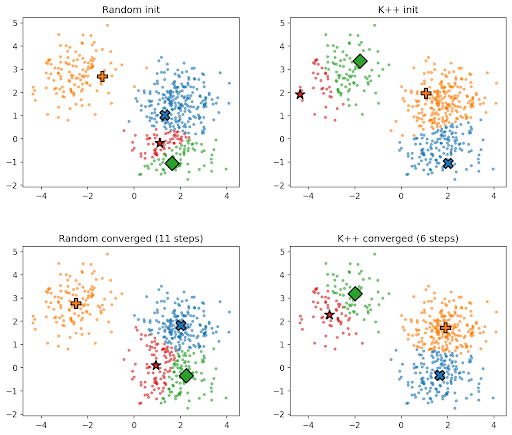
Figure 3: Two initialization strategies on the same data. K++ places starting centroids more deliberately than random, which tends to reduce the number of iterations needed. The converged results may differ between runs — this is normal, and both can be valid solutions.
The K-means++ strategy is the industry standard, and works better than random initialization. It also worked better than the two variants I experimented with, which tried to distribute the starting points based upon the statistical distribution of the data. But the framework was flexible enough to support my experimentation, so it didn’t matter if I pursued a few dead ends.
Records
In order to keep track of my increasingly large number of test variations I built data records into each test.
Each time a k-means implementation runs, it returns a record containing data and meta-data relevant to that run: which implementation was used, the name of the dataset, which initialization strategy, how many clusters were requested, how long it took, how much memory it consumed, and the inertia. The actual cluster assignments and centroid positions are included too, since those feed into downstream evaluation.
This provides excellent organization when sweeping through any combination of implementation, dataset, initialization strategy, and cluster count, by collecting all of these records into a flat list. Because every record has the same contents regardless of which implementation produced it, I can filter and group them freely: pull out everything that ran on a particular dataset, or everything that used a particular initialization, or compare two implementations head-to-head across all conditions. The charts and metrics in the notebook all work from this same list. There’s no need for reformatting or special-casing for different implementations. Adding a new implementation means writing the function and making sure it returns the standard record. All of the other framework tools will then work with these results automatically.
Validation
Finally I ensured that I had a reliable baseline version of k-means. Since this is a well known algorithm there is a highly tested implementation in the sklearn library. I could use this to compare the validity of my other implementations. If my implementations converged to meaningfully different results than sklearn on the same data with the same initialization, something was wrong.
I could also use this to assess how well they compare versus this standardized function. I could look at the accuracy of sklearn vs. my implementations, but also the timing and memory usage. This is particularly important as I use LLMs to help me develop my code. An LLM will promise that it has generated a perfect algorithm, but it must be verified!
The creation of multiple datasets and validation code is similar to the concept of Test Driven Development (TDD). The idea is that you should think about how you can test your code before you begin writing it. In this case, I didn’t just write unit tests, I was able to run the standard sklearn k-means implementation against a variety of datasets before I started creating variations. This provided me with high confidence that my versions, which produce similar results, are accurate.
Next Step
By this point I had coded up a couple of algorithms, produced a framework, and begun testing my code. Everything was in place and I was ready to move to the next step. The larger datasets I tested against were running slowly as I ran up against the k-means algorithm scaling issues. The GPU-based implementations were the next changes I wanted to experiment with, to see if they could reduce run time.
In part 2 I’ll get into how GPUs actually work and why they’re well suited to this problem, then show what happens when you run the same datasets through GPU-accelerated implementations.